mirror of https://github.com/go-gitea/gitea
Tag:
Branch:
Tree:
0983b237d5
main
release/v1.10
release/v1.11
release/v1.12
release/v1.13
release/v1.14
release/v1.15
release/v1.16
release/v1.17
release/v1.18
release/v1.19
release/v1.20
release/v1.21
release/v1.22
release/v1.22-legacy
release/v1.8
release/v1.9
v0.9.99
v1.0.0
v1.0.1
v1.0.2
v1.1.0
v1.1.1
v1.1.2
v1.1.3
v1.1.4
v1.10.0
v1.10.0-dev
v1.10.0-rc1
v1.10.0-rc2
v1.10.1
v1.10.2
v1.10.3
v1.10.4
v1.10.5
v1.10.6
v1.11.0
v1.11.0-dev
v1.11.0-rc1
v1.11.0-rc2
v1.11.1
v1.11.2
v1.11.3
v1.11.4
v1.11.5
v1.11.6
v1.11.7
v1.11.8
v1.12.0
v1.12.0-dev
v1.12.0-rc1
v1.12.0-rc2
v1.12.1
v1.12.2
v1.12.3
v1.12.4
v1.12.5
v1.12.6
v1.13.0
v1.13.0-dev
v1.13.0-rc1
v1.13.0-rc2
v1.13.1
v1.13.2
v1.13.3
v1.13.4
v1.13.5
v1.13.6
v1.13.7
v1.14.0
v1.14.0-dev
v1.14.0-rc1
v1.14.0-rc2
v1.14.1
v1.14.2
v1.14.3
v1.14.4
v1.14.5
v1.14.6
v1.14.7
v1.15.0
v1.15.0-dev
v1.15.0-rc1
v1.15.0-rc2
v1.15.0-rc3
v1.15.1
v1.15.10
v1.15.11
v1.15.2
v1.15.3
v1.15.4
v1.15.5
v1.15.6
v1.15.7
v1.15.8
v1.15.9
v1.16.0
v1.16.0-dev
v1.16.0-rc1
v1.16.1
v1.16.2
v1.16.3
v1.16.4
v1.16.5
v1.16.6
v1.16.7
v1.16.8
v1.16.9
v1.17.0
v1.17.0-dev
v1.17.0-rc1
v1.17.0-rc2
v1.17.1
v1.17.2
v1.17.3
v1.17.4
v1.18.0
v1.18.0-dev
v1.18.0-rc0
v1.18.0-rc1
v1.18.1
v1.18.2
v1.18.3
v1.18.4
v1.18.5
v1.19.0
v1.19.0-dev
v1.19.0-rc0
v1.19.0-rc1
v1.19.1
v1.19.2
v1.19.3
v1.19.4
v1.2.0
v1.2.0-rc1
v1.2.0-rc2
v1.2.0-rc3
v1.2.1
v1.2.2
v1.2.3
v1.20.0
v1.20.0-dev
v1.20.0-rc0
v1.20.0-rc1
v1.20.0-rc2
v1.20.1
v1.20.2
v1.20.3
v1.20.4
v1.20.5
v1.20.6
v1.21.0
v1.21.0-dev
v1.21.0-rc0
v1.21.0-rc1
v1.21.0-rc2
v1.21.1
v1.21.10
v1.21.11
v1.21.2
v1.21.3
v1.21.4
v1.21.5
v1.21.6
v1.21.7
v1.21.8
v1.21.9
v1.22.0
v1.22.0-dev
v1.22.0-rc0
v1.22.0-rc1
v1.22.1
v1.22.2
v1.22.3
v1.23.0-dev
v1.3.0
v1.3.0-rc1
v1.3.0-rc2
v1.3.1
v1.3.2
v1.3.3
v1.4.0
v1.4.0-rc1
v1.4.0-rc2
v1.4.0-rc3
v1.4.1
v1.4.2
v1.4.3
v1.5.0
v1.5.0-dev
v1.5.0-rc1
v1.5.0-rc2
v1.5.1
v1.5.2
v1.5.3
v1.6.0
v1.6.0-dev
v1.6.0-rc1
v1.6.0-rc2
v1.6.1
v1.6.2
v1.6.3
v1.6.4
v1.7.0
v1.7.0-dev
v1.7.0-rc1
v1.7.0-rc2
v1.7.0-rc3
v1.7.1
v1.7.2
v1.7.3
v1.7.4
v1.7.5
v1.7.6
v1.8.0
v1.8.0-rc1
v1.8.0-rc2
v1.8.0-rc3
v1.8.1
v1.8.2
v1.8.3
v1.9.0
v1.9.0-dev
v1.9.0-rc1
v1.9.0-rc2
v1.9.1
v1.9.2
v1.9.3
v1.9.4
v1.9.5
v1.9.6
${ noResults }
12 Commits (0983b237d50c8648f96f42e776c4529072e7eca9)
| Author | SHA1 | Message | Date |
|---|---|---|---|
|
|
d149093ce3
|
Fix code view (diff) broken layout (#23096)
Close #22911 I think it's ready for review now, feel free to test it, welcome to help to improve. ### Before  ### After  |
2 years ago |
|
|
5115ffa90c
|
Remove fomantic ".link" selector and styles (#23888)
It's difficult to play with Fomantic's ".link" selector&styles, and it doesn't bring any real benefit. Instead, it sometimes introduces regressions (because of the `:not` selector, really difficult to fine-tune). Regression: <details>  </details> After this PR, there is no ".link" in code anymore. We do not need to play the overwriting and `:not()` game anymore.  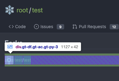   |
2 years ago |
|
|
5cc0801de9
|
Introduce GitHub markdown editor, keep EasyMDE as fallback (#23876)
The first step of the plan * #23290 Thanks to @silverwind for the first try in #15394 . Close #10729 and a lot of related issues. The EasyMDE is not removed, now it works as a fallback, users can switch between these two editors. Editor list: * Issue / PR comment * Issue / PR comment edit * Issue / PR comment quote reply * PR diff view, inline comment * PR diff view, inline comment edit * PR diff view, inline comment quote reply * Release editor * Wiki editor Some editors have attached dropzone Screenshots: <details> 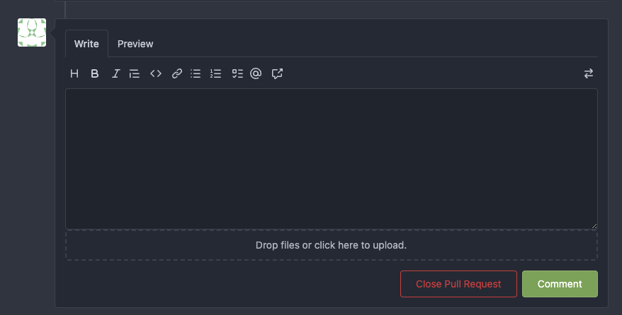 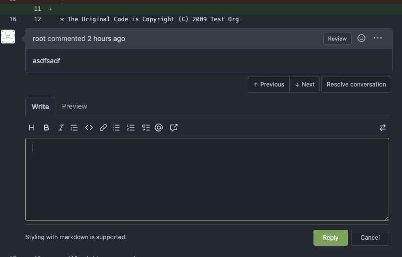  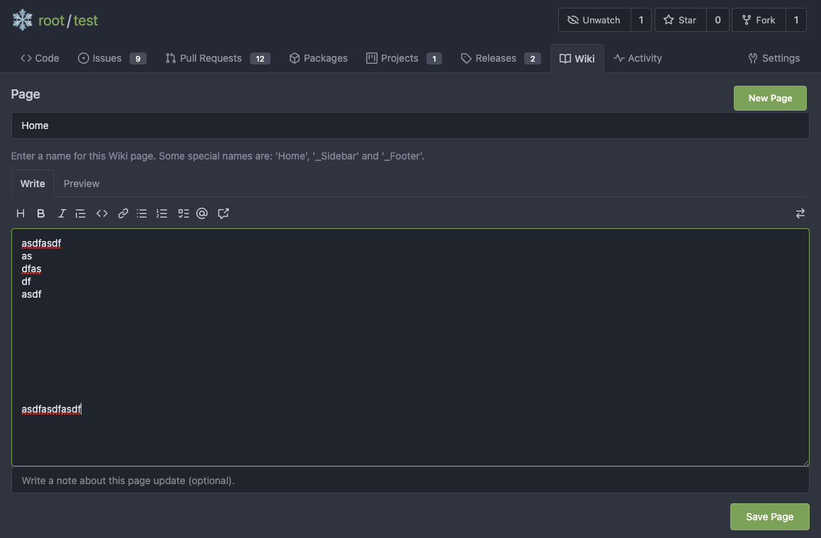 </details> --------- Co-authored-by: silverwind <me@silverwind.io> |
2 years ago |
|
|
aa4d1d94f7
|
Diff improvements (#23553)
- Avoid flash of wrong tree toggle icon on page load by setting icon based on sync state - Avoid "pop-in" of tree on page load by leaving space based on sync state - Use the same border/box-shadow combo used on comment `:target` also for file `:target`. - Refactor `DiffFileTree.vue` to use `toggleElem` instead of hardcoded class name. - Left-align inline comment boxes and make them fit the same amount of markup content on a line as GitHub. - Fix height of `diff-file-list` Fixes: https://github.com/go-gitea/gitea/issues/23593 <img width="1250" alt="Screenshot 2023-03-18 at 00 52 04" src="https://user-images.githubusercontent.com/115237/226071392-6789a644-aead-4756-a77e-aba3642150a0.png"> <img width="1246" alt="Screenshot 2023-03-18 at 00 59 43" src="https://user-images.githubusercontent.com/115237/226071443-8bcba924-458b-48bd-b2f0-0de59cb180ac.png"> <img width="1250" alt="Screenshot 2023-03-18 at 01 27 14" src="https://user-images.githubusercontent.com/115237/226073121-ccb99f9a-d3ac-40b7-9589-43580c4a01c9.png"> <img width="1231" alt="Screenshot 2023-03-19 at 21 44 16" src="https://user-images.githubusercontent.com/115237/226207951-81bcae1b-6b41-4e39-83a7-0f37951df6be.png"> (Yes I'm aware the border-radius in bottom corners is suboptimal, but this would be notorously hard to fix without relying on `overflow: hidden`). |
2 years ago |
|
|
12fff36d05
|
Fine tune more downdrop settings, use SVG for labels, improve Repo Topic Edit form (#23626)
Although it seems that some different purposes are mixed in this PR, however, they are all related, and can be tested together, so I put them together to save everyone's time. Diff: `+79 −84`, everything becomes much better. ### Improve the dropdown settings. Move all fomantic-init related code into our `fomantic.js` Fine-tune some dropdown global settings, see the comments. Also help to fix the first problem in #23625 , cc: @yp05327 The "language" menu has been simplified, and it works with small-height window better. ### Use SVG instead of `<i class="delete icon">` It's also done by `$.fn.dropdown.settings.templates.label` , cc: @silverwind ### Remove incorrect `tabable` CSS class It doesn't have CSS styles, and it was only in Vue. So it's totally unnecessary, remove it by the way. ### Improve the Repo Topic Edit form * Simplify the code * Add a "Cancel" button * Align elements Before: <details>  </details> After:  |
2 years ago |
|
|
a9cceb0597
|
Fix long project name display in issue list and in related dropdown (#23653)
This PR is to fix the second problem mentioned in #23625, along with the
long texts problem in `issue-item-bottom-row` of `issuelist.tmpl`
Main changes are:
1. Add `max-width` to the search dropdowns in issue list and make the
possible long texts inside to show ellipsis if texts are long
2. Adjust the conditions in
[issuelist.tmpl](
|
2 years ago |
|
|
ca0ce9feb0
|
Set opaque background on markup and images (#23578)
- Set opaque background on markup images so they can visually break `<hr>` - Change padding of comment box so `padding` is provided by the `.markup` element instead of its parent, matching the file rendering view which does the same. Before: <img width="243" alt="Screenshot 2023-03-19 at 19 22 03" src="https://user-images.githubusercontent.com/115237/226198663-8ff4d940-6a15-452d-ac58-14485b37fbc7.png"> After: <img width="261" alt="Screenshot 2023-03-19 at 19 23 26" src="https://user-images.githubusercontent.com/115237/226198689-1bf56561-4726-46dc-b583-423d65e1e13a.png"> <img width="263" alt="image" src="https://user-images.githubusercontent.com/115237/226199002-e93c817d-6d9c-4b98-bad8-0aa0bd45b62f.png"> Example documents: https://try.gitea.io/silverwind/symlink-test/src/branch/master/test-page.md https://github.com/silverwind/symlink-test/blob/master/test-page.md |
2 years ago |
|
|
9efcce563b
|
Fix sticky header in diff view (#23554)
Ressurection of #23549. Fix regression https://github.com/go-gitea/gitea/pull/23513#issuecomment-1474356817 from #23271. The previous sticky CSS did assume the content is always 2 rows, but since that PR, it's single-row above 993px width. Adjust the sticky offset to match and add a small tweak that hides content behind the `border-radius`. Single row: <img width="1264" alt="Screenshot 2023-03-17 at 21 33 05" src="https://user-images.githubusercontent.com/115237/226034050-a04b131d-fd3f-45c0-bc72-413738a59825.png"> Double row: <img width="1243" alt="Screenshot 2023-03-17 at 21 32 53" src="https://user-images.githubusercontent.com/115237/226034163-2f1c6aa9-fc72-432f-bc46-9a7119da8677.png"> |
2 years ago |
|
|
d42015e6eb
|
Fix long name ui issues and label ui issue (#23541)
This PR fixes some ui problems as mentioned in the two issues below. 1. Long file path has no word break ## Before <img width="1357" alt="截屏2023-03-17 17 49 43" src="https://user-images.githubusercontent.com/17645053/225873491-27c7bf9a-d5d5-4065-9e4a-ff228e935abf.png"> ## After <img width="1248" alt="截屏2023-03-17 17 51 22" src="https://user-images.githubusercontent.com/17645053/225873562-93b87af7-9c83-43f8-aa0d-36a9174d25ac.png"> on mobile <img width="408" alt="截屏2023-03-17 17 51 15" src="https://user-images.githubusercontent.com/17645053/225873554-1b8c8999-1dfc-4251-a7fc-20ecd3444cb0.png"> 2. Texts in labels ## Before <img width="1219" alt="截屏2023-03-17 17 49 24" src="https://user-images.githubusercontent.com/17645053/225873369-812b1b52-c104-4e32-988f-c3e55ad2f844.png"> ## After <img width="1259" alt="截屏2023-03-17 17 51 31" src="https://user-images.githubusercontent.com/17645053/225873317-9717fd2c-e9e1-4a00-a27d-6bdc5933c3ca.png"> with two labels <img width="1258" alt="截屏2023-03-17 17 51 53" src="https://user-images.githubusercontent.com/17645053/225873323-13198192-71de-472d-8e78-6fd86ddba3d9.png"> In explore and star pages <img width="896" alt="截屏2023-03-17 18 25 00" src="https://user-images.githubusercontent.com/17645053/225878962-9e26e3aa-cff0-451c-9133-19f4ad1507a4.png"> <img width="913" alt="截屏2023-03-17 18 25 09" src="https://user-images.githubusercontent.com/17645053/225878967-6adaa414-136e-43c2-87d0-7e46a0da112e.png"> 3. Long name repository on creating new fork page ## Before <img width="919" alt="截屏2023-03-17 17 50 01" src="https://user-images.githubusercontent.com/17645053/225873723-5c4ea137-3b51-4074-a458-ef442e330ddf.png"> ## After <img width="907" alt="截屏2023-03-17 17 50 37" src="https://user-images.githubusercontent.com/17645053/225873772-fc4a52c3-49c6-4ca6-903d-a13707f2a98b.png"> <img width="383" alt="截屏2023-03-17 17 50 48" src="https://user-images.githubusercontent.com/17645053/225873779-6de1dfde-5c05-4ae9-89e1-85c25b3a1682.png"> Closes #23535 Closes #23534 |
2 years ago |
|
|
6bad0fb24f
|
Fix review comment context menu clipped bug (#23523)
This is another regression of #22959 (the first regression has been fixed by the Image Diff fix) Close #23517 This is a quick fix. Luckily, there is no "dropdown menu" for image/csv view, so we could only add the "overflow-x: scroll" to the image/csv view. After fix:   Co-authored-by: KN4CK3R <admin@oldschoolhack.me> |
2 years ago |
|
|
661e78bed5
|
Allow both fullname and username search when `DEFAULT_SHOW_FULL_NAME` is true (#23463)
This PR adds the ability to search both fullname and username for
assignees, reviewers and author search boxes when the config
[`DEFAULT_SHOW_FULL_NAME`](
|
2 years ago |
|
|
202803fc69
|
Replace Less with CSS (#23481)
Ran most of the Less files through the Less compiler and Prettier and then followed up with a round of manual fixes. The Less compiler had unfortunately stripped all `//` style comments that I had to restore (It did preserve `/* */` comments). Other fixes include duplicate selector removal which were revealed after the transpilation and which weren't caught by stylelint before but now are. Fixes: https://github.com/go-gitea/gitea/issues/15565 |
2 years ago |