36de5b299b
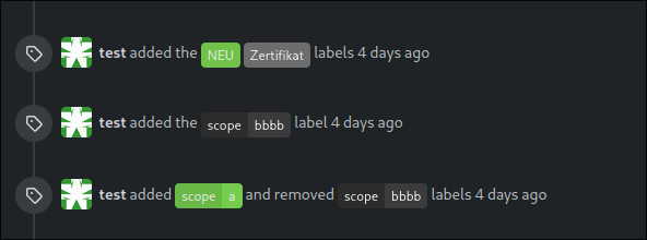
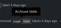
Highlight archived labels ( #29680 )
...
the issue is, that you can not distinguish between normal and archived
labels.
So this will make archived labels 80% **grayscale**. And prepend
"Archived: " to the tooltip info


---
*Sponsored by Kithara Software GmbH*
---------
Co-authored-by: delvh <dev.lh@web.de>
8 months ago
7e8c1c5ba1
Replace more `gt-` with `tw-`, update frontend docs ( #29595 )
...
Tested a few things, all working fine. Not sure if the chinese machine
translation is good.

---------

Co-authored-by: wxiaoguang <wxiaoguang@gmail.com>
9 months ago
4adc2a828d
Hide archived labels by default from the suggestions when assigning labels for an issue ( #27451 )
...
Followup of #27115
Finally closes #25237
## Screenshots
### Issue Sidebar
<img width="513" alt="image"
src="https://github.com/go-gitea/gitea/assets/80308335/9f7fda2f-5a03-4684-8619-fd3498a95b41 ">
### PR sidebar
<img width="367" alt="image"
src="https://github.com/go-gitea/gitea/assets/80308335/53db9b64-faec-4a67-91d6-76945596a469 ">
### PR sidebar with archived labels shown
<img width="352" alt="image"
src="https://github.com/go-gitea/gitea/assets/80308335/9dc5050f-4e69-4f76-bb83-582480a2281e ">
---------
Signed-off-by: puni9869 <punitinani1@hotmail.com>
Co-authored-by: silverwind <me@silverwind.io>
1 year ago
7960ba7e2b
Always use `ctx.Locale.Tr` inside templates ( #27231 )
1 year ago
d5703d4a1b
Remove "TODO" tasks from CSS file ( #26835 )
...
1. Use `gt-invisible` instead of `invisible`.
2. Use `gt-word-break` instead of `dont-break-out` (there is a slight
different "hyphens", but I think it won't affect too much since it is
only used for the "full name").
3. Remove `.small.button:has(svg)` , now our buttons could layout SVG
correctly, and actually I didn't see this CSS class is used in code.
1 year ago
576644d815
Simplify helper CSS classes and avoid abuse ( #26728 )
...
Removed CSS helper classes (some of them are not useful while some of
them are abused often)
* `gt-db`: in most cases it could be replaced by `gt-df` and the flex
layout should be encouraged. Other cases: either it does need the
`gt-df` (eg: by using `div` directly) or it is an abuse (eg: the warning
message in a form)
* `gt-di`: it doesn't seem useful, or it could be replaced by `gt-dib`
in most cases.
* `gt-dif`: not useful, it could be replaced by `flex-text-inline` or
`gt-df`
* `gt-js`: never used
* All `<i class="icon gt-df gt-ac gt-jc">` could be written as `<i
class="icon">`
## Some UI samples
### Admin Notice

### Admin Stacktrace

### Org Home

### Org Team Repo

### Release List

### User Setting Application Token Scope

Co-authored-by: Giteabot <teabot@gitea.io>
1 year ago
00dbba7f42
Several fixes for mobile UI ( #25634 )
...
Resolves #25622
<details>
<summary>Screenshots</summary>


</details>
---------
Co-authored-by: wxiaoguang <wxiaoguang@gmail.com>
Co-authored-by: silverwind <me@silverwind.io>
1 year ago
64f2d70262
Replace fomantic divider module with our own ( #25539 )
...
Should look exactly like before for normal dividers. "Horizontal" ones
look better because they no longer use image backgrounds.
<img width="917" alt="Screenshot 2023-06-27 at 19 07 56"
src="https://github.com/go-gitea/gitea/assets/115237/d97d8dec-6859-44a8-85ba-e4549b4dd9df ">
<img width="914" alt="Screenshot 2023-06-27 at 19 05 58"
src="https://github.com/go-gitea/gitea/assets/115237/8bf98544-2d82-4ebf-ac68-d6dc237bd6b2 ">
<img width="1246" alt="Screenshot 2023-06-27 at 19 00 42"
src="https://github.com/go-gitea/gitea/assets/115237/36a6bb21-6029-4f53-8bee-535f55c66fed ">
<img width="344" alt="Screenshot 2023-06-27 at 18 58 15"
src="https://github.com/go-gitea/gitea/assets/115237/a9e70aee-8e6b-4ea1-9e93-19c9f96aec6e ">
<img width="823" alt="Screenshot 2023-06-27 at 18 56 22"
src="https://github.com/go-gitea/gitea/assets/115237/e7a497cd-f262-4683-8872-23c3c8cce32f ">
<img width="330" alt="Screenshot 2023-06-27 at 19 21 11"
src="https://github.com/go-gitea/gitea/assets/115237/42f24149-a655-4c7e-bd26-8ab52db6446b ">
1 year ago
73b57c2992
Improve dropdown menus, remove inline styles ( #24954 )
...
Before:
<img width="190" alt="Screenshot 2023-05-27 at 10 46 43"
src="https://github.com/go-gitea/gitea/assets/115237/b9331fcd-db1d-476e-87f0-f79bae48b1a5 ">
After:
<img width="154" alt="Screenshot 2023-05-28 at 19 29 03"
src="https://github.com/go-gitea/gitea/assets/115237/8b7f99a2-01a8-4665-9342-a6201b51d30f ">
---------
Co-authored-by: Giteabot <teabot@gitea.io>
1 year ago
e95b42e187
Improve accessibility when (re-)viewing files ( #24817 )
...
Visually, nothing should have changed.
Changes include
- Convert most `<a [no href]>` to `<button>` when (re-)viewing files:
- `<a [no href]>` are, by HTML definition, not a link and hence cannot
be focused
- `<a class="ui button">` can now be clicked (again?) using
<kbd>Enter</kbd>
- Previously, the installed keypress handler on `.ui.button` elements
disabled it for links somehow
- The `(un)escape file`, the `expand section` and the `expand/collapse
file` buttons can now be focused (and subsequently clicked using only
the keyboard)
- You can now press <kbd>Space</kbd> on a focused `View file` checkbox
to mark the file as viewed.
- previously, this was impossible as this checkbox listened on the wrong
event listener

The `add code comment` button has been left inaccessible for now as it
requires quite a bit of extra logic so that it is unhidden when it is
focused (you can otherwise focus it without seeing it as you are not
hovering on the corresponding line).

---------

Co-authored-by: silverwind <me@silverwind.io>
2 years ago
43c136200a
Deduplicate template code for label selection menu ( #23431 )
2 years ago