Two small CSS fixes:

1. Fix basic primary label hover
2. Fix border color of divider in dropdown and remove margin so it looks
better with hover effect, as discussed in
https://github.com/go-gitea/gitea/pull/24143:
A vertical overflow appears in Firefox 112/MacOS 12.6 when the system
setting for scrollbars is to "Always" show them.
---
Here, the fixed 100vw container widths are removed, which removes the
overflow. It is, however, only simulated in Developer Tools in latest
Firefox and Chromium, so please test on a Gitea installation.
1. Remove unnecessary `btn-link` `muted` classes
* Link is link, button is button, I can't see a real requirement to make
a button like a link.
* If anyone insists, please help to show me real example from modern
frameworks / websites, how and why they do so.
* No need to duplicate a lot of class names on similar elements
* Declare styles clearly, for example, `markdown-toolbar` itself should
have `display: flex`, but not use `gt-df` to overwrite the `display:
block`.
2. Remove unnecessary `role` attribute
* https://github.com/github/markdown-toolbar-element/issues/70
* The `markdown-toolbar-element` does want to add `role=button`, but
there is a bug.
* So we do the similar thing as upstream does (add the role by JS),
until they fix their bugs.
3. Indent `markdown-switch-easymde` (before it doesn't have a proper
indent)
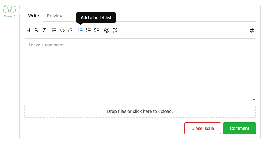
Screenshot:

Followup of #23876 according to my unreleased review demanding tooltips.
Additionally
- add a `muted` equivalent for buttons
- convert `switch to legacy` to an actual button
- enroll `switch to legacy` in the builtin pseudo focus cycle
- remove spaces between the buttons
The effect of the `muted` class is what you would expect: The button
loses all of its normal styling, and is defined only by its content instead.
This will help reduce a11y infractions in the future, as that was one of
the major points why people didn't use `<button>` tags and decided on a
bad fix (i.e. through `<div>`s) instead.
## Appearance

---------
Co-authored-by: silverwind <me@silverwind.io>
Although it seems that some different purposes are mixed in this PR,
however, they are all related, and can be tested together, so I put them
together to save everyone's time.
Diff: `+79 −84`, everything becomes much better.
### Improve the dropdown settings.
Move all fomantic-init related code into our `fomantic.js`
Fine-tune some dropdown global settings, see the comments.
Also help to fix the first problem in #23625 , cc: @yp05327
The "language" menu has been simplified, and it works with small-height
window better.
### Use SVG instead of `<i class="delete icon">`
It's also done by `$.fn.dropdown.settings.templates.label` , cc:
@silverwind
### Remove incorrect `tabable` CSS class
It doesn't have CSS styles, and it was only in Vue. So it's totally
unnecessary, remove it by the way.
### Improve the Repo Topic Edit form
* Simplify the code
* Add a "Cancel" button
* Align elements
Before:
<details>

</details>
After:

1. The "close" inside "modal" are likely broken for long time
    * There is no var called `--body-color`
    * There is no `fullscreen modal`
* The `.ui.modal > .close.inside` doesn't seem to match most icons. It
only matches a few like "fork-repo-modal" or "adopt repo". Other places
are just buggy code copied again and again.
2. Convert the legacy `&:hover` LESS syntax to CSS syntax
Ran most of the Less files through the Less compiler and Prettier and
then followed up with a round of manual fixes.

The Less compiler had unfortunately stripped all `//` style comments
that I had to restore (It did preserve `/* */` comments). Other fixes
include duplicate selector removal which were revealed after the
transpilation and which weren't caught by stylelint before but now are.

Fixes: https://github.com/go-gitea/gitea/issues/15565
Follow #23394
There were many bad smells in old code. This PR only moves the code into
Vue SFC, doesn't touch the unrelated logic.
update: after
5f23218c85
, there should be no usage of the vue-rumtime-compiler anymore
(hopefully), so I think this PR could close#19851
---------
Co-authored-by: Lunny Xiao <xiaolunwen@gmail.com>
- Upgrade stylelint and plugin
- Change ruleset to a explicit one, with all deprecated rules removed
- Fix new issues detected by value validation

For `overflow: overlay` see
https://github.com/stylelint/stylelint/issues/6667
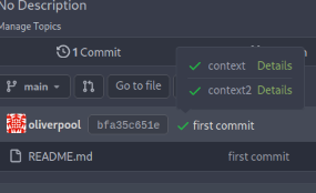
Since #22632, when a commit status has multiple checks, no check is
shown at all (hence no way to see the other checks).
This PR fixes this by always adding a tag with the
`.commit-statuses-trigger` to the DOM (the `.vm` is for vertical
alignment).

---------
Co-authored-by: Lunny Xiao <xiaolunwen@gmail.com>
Close#22847
This PR:
* introduce Gitea's own `showElem` and related functions
* remove jQuery show/hide
* remove .hide class
* remove inline style=display:none
From now on:
do not use:
* "[hidden]" attribute: it's too weak, can not be applied to an element
with "display: flex"
* ".hidden" class: it has been polluted by Fomantic UI in many cases
* inline style="display: none": it's difficult to tweak
* jQuery's show/hide/toggle: it can not show/hide elements with
"display: xxx !important"
only use:
* this ".gt-hidden" class
* showElem/hideElem/toggleElem functions in "utils/dom.js"
cc: @silverwind , this is the all-in-one PR
Add a new "exclusive" option per label. This makes it so that when the
label is named `scope/name`, no other label with the same `scope/`
prefix can be set on an issue.

The scope is determined by the last occurence of `/`, so for example
`scope/alpha/name` and `scope/beta/name` are considered to be in
different scopes and can coexist.

Exclusive scopes are not enforced by any database rules, however they
are enforced when editing labels at the models level, automatically
removing any existing labels in the same scope when either attaching a
new label or replacing all labels.

In menus use a circle instead of checkbox to indicate they function as
radio buttons per scope. Issue filtering by label ensures that only a
single scoped label is selected at a time. Clicking with alt key can be
used to remove a scoped label, both when editing individual issues and
batch editing.

Label rendering refactor for consistency and code simplification:

* Labels now consistently have the same shape, emojis and tooltips
everywhere. This includes the label list and label assignment menus.
* In label list, show description below label same as label menus.
* Don't use exactly black/white text colors to look a bit nicer.
* Simplify text color computation. There is no point computing luminance
in linear color space, as this is a perceptual problem and sRGB is
closer to perceptually linear.
* Increase height of label assignment menus to show more labels. Showing
only 3-4 labels at a time leads to a lot of scrolling.
* Render all labels with a new RenderLabel template helper function.

Label creation and editing in multiline modal menu:

* Change label creation to open a modal menu like label editing.
* Change menu layout to place name, description and colors on separate
lines.
* Don't color cancel button red in label editing modal menu.
* Align text to the left in model menu for better readability and
consistent with settings layout elsewhere.

Custom exclusive scoped label rendering:

* Display scoped label prefix and suffix with slightly darker and
lighter background color respectively, and a slanted edge between them
similar to the `/` symbol.
* In menus exclusive labels are grouped with a divider line.

---------

Co-authored-by: Yarden Shoham <hrsi88@gmail.com>
Co-authored-by: Lauris BH <lauris@nix.lv>
This should eliminate all non-variable color usage in the styles, making
gitea fully themeable via CSS variables. Also, it adds a linter to
enforce variables for colors.
Move the text color rules out of the unneeded `.ui` block, add missing
colors, tweak colors on arc-green to be more readable (red was
particulary bad to read).

Also, this removes the previous inheritance of link colors. I think
links should always be in primary color and if they are to be
discolored, the color should be set on them explicitely.

<img width="165" alt="Screenshot 2022-11-12 at 13 28 30"
src="https://user-images.githubusercontent.com/115237/201474098-700d9fed-3133-43c7-b57e-d4cc5c2795cb.png">

<img width="152" alt="Screenshot 2022-11-12 at 13 18 48"
src="https://user-images.githubusercontent.com/115237/201474156-b6de4cb5-bce8-4553-b3d4-8365aff9a3a7.png">

HTML to test with:

```html
<div class="text red">some text with <a href="#foo">a link</a>.</div>
<div class="text orange">some text with <a href="#foo">a link</a>.</div>
<div class="text yellow">some text with <a href="#foo">a link</a>.</div>
<div class="text olive">some text with <a href="#foo">a link</a>.</div>
<div class="text green">some text with <a href="#foo">a link</a>.</div>
<div class="text teal">some text with <a href="#foo">a link</a>.</div>
<div class="text blue">some text with <a href="#foo">a link</a>.</div>
<div class="text violet">some text with <a href="#foo">a link</a>.</div>
<div class="text purple">some text with <a href="#foo">a link</a>.</div>
<div class="text pink">some text with <a href="#foo">a link</a>.</div>
<div class="text brown">some text with <a href="#foo">a link</a>.</div>
<div class="text grey">some text with <a href="#foo">a link</a>.</div>
This changes the rendering logic of issue titles. If a substring in an
issue title is enclosed with a pair of backticks, it'll be rendered with
a monospace font (HTML `code` tag).
* Closes#20887
Signed-off-by: Yarden Shoham <hrsi88@gmail.com>
Co-authored-by: Gusted <williamzijl7@hotmail.com>
Co-authored-by: wxiaoguang <wxiaoguang@gmail.com>
Co-authored-by: 6543 <6543@obermui.de>
Adds the settings pages to create OAuth2 apps also to the org settings
and allows to create apps for orgs.

Refactoring: the oauth2 related templates are shared for
instance-wide/org/user, and the backend code uses `OAuth2CommonHandlers`
to share code for instance-wide/org/user.

Co-authored-by: wxiaoguang <wxiaoguang@gmail.com>
At the moment, this is only used to replace the color of the `viewed`
checkbox and of the `has changed` label.
Previously, the used variable accentuated always either darker or
lighter, which meant that one theme looked good while the other didn't.

Co-authored-by: silverwind <me@silverwind.io>