39d2fdefaf
Split org Propfile README to a new tab `overview` ( #31373 )
...
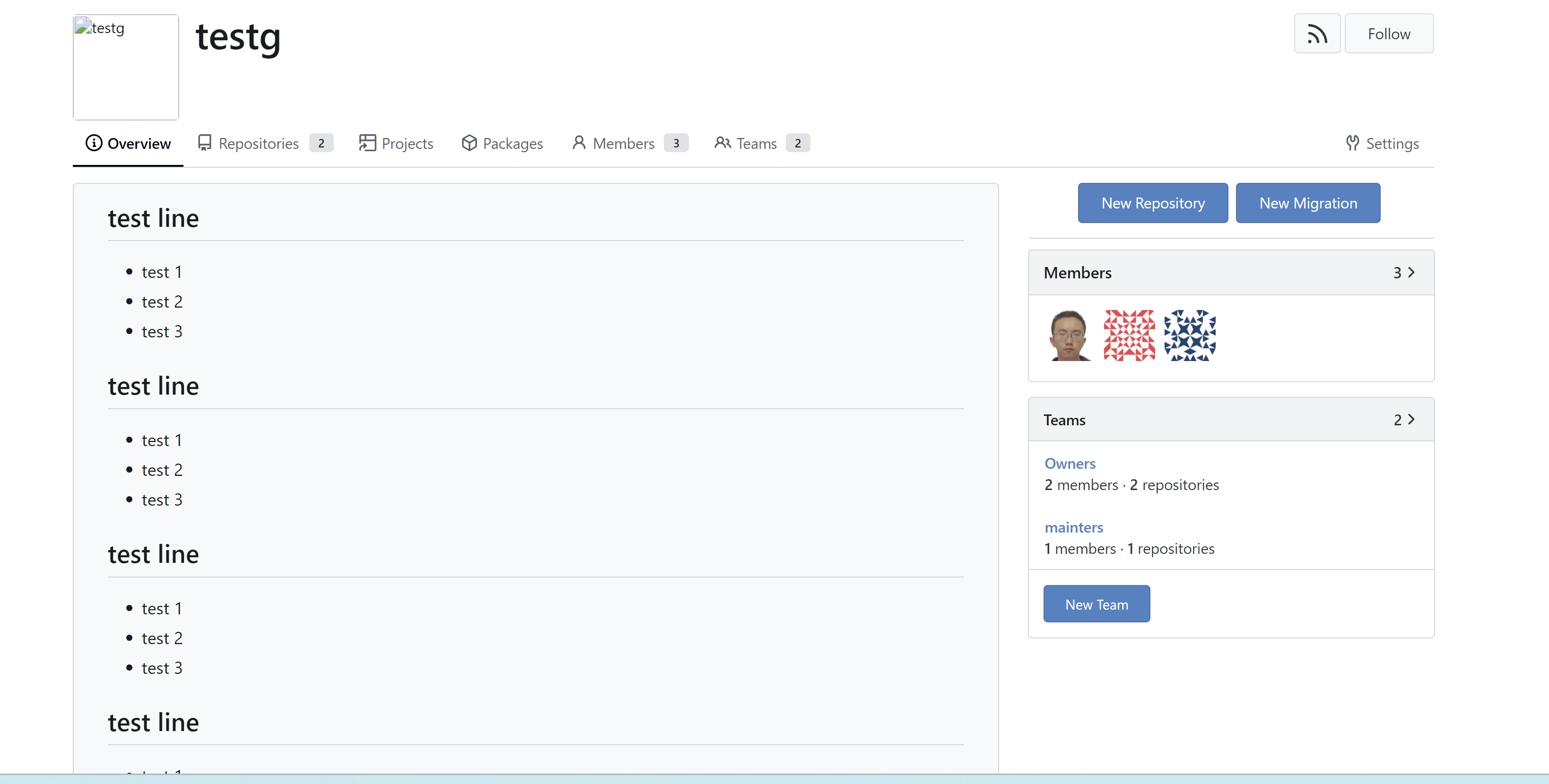
like user profile, add a new overviw tab to show profile READEME when it
is exist.
replace #31349 (another solution option)
example view:

---------
Signed-off-by: a1012112796 <1012112796@qq.com>
3 months ago
059b2718a5
Right align the "Settings" menu item in overflow-menu ( #30764 )
...
I guess there could be enough people liking to make the Settings menu
item right aligned. As a site admin, I found it's easier to find the
right-aligned Settings menu item.
Tested with various sizes:


7 months ago
a3d9f0d915
Fix all rounded borders, change affected tab menus to pills ( #30707 )
...
Fixes https://github.com/go-gitea/gitea/issues/30673 , all 23 issues.
Notes:
- Tab bar menus had to change to pills because of unsolvable issue with
the border-radius as tab bar renders a overlapping border onto the box
below. And I think pills look better.
- Added padding to code editor empty preview message
- Hide monaco's built-in blue focus border, we don't need it and it
never showed before either.
- Label add menu is simplified, removing the nested segment.
<img width="1322" alt="Screenshot 2024-04-25 at 22 26 19"
src="https://github.com/go-gitea/gitea/assets/115237/7e394e0c-b7ad-417d-8e9f-12f1dea93ed1 ">
<img width="1326" alt="Screenshot 2024-04-25 at 22 28 00"
src="https://github.com/go-gitea/gitea/assets/115237/66c8499f-aa9f-4d95-8cca-ef13dfa82c65 ">
<img width="997" alt="Screenshot 2024-04-25 at 22 36 53"
src="https://github.com/go-gitea/gitea/assets/115237/07896102-c71d-4246-8173-c2bc2e1d3cae ">
<img width="832" alt="Screenshot 2024-04-25 at 22 56 09"
src="https://github.com/go-gitea/gitea/assets/115237/d83afc96-08ca-4adc-baf4-3d02804be57c ">
<img width="361" alt="Screenshot 2024-04-25 at 22 57 12"
src="https://github.com/go-gitea/gitea/assets/115237/c7371a68-00b5-47d8-84d0-ddc5268b2b2c ">
---------
Co-authored-by: wxiaoguang <wxiaoguang@gmail.com>
Co-authored-by: Giteabot <teabot@gitea.io>
7 months ago
aff7b7bdd2
Remove obsolete CSS text classes ( #30576 )
...
- `.text-thin` and `.text-italic` are not present in CSS so were doing nothing and I removed them.
- `.text.middle` was unused so I removed it.
- `.text.italic` is replaced with `tw-italic`.
- `.text.normal` had exactly one use and it wasn't even needed.
- add a `muted` class to the link to `org_profile_avatar.tmpl`.

---------

Co-authored-by: wxiaoguang <wxiaoguang@gmail.com>
7 months ago
9946353282
Remove fomantic button module ( #30475 )
...
CSS-only module. Button colors are reduced to this:
<img width="639" alt="Screenshot 2024-04-14 at 15 36 07"
src="https://github.com/go-gitea/gitea/assets/115237/882d6c02-d1de-44f2-b707-db02a9f5070d ">
---------
Co-authored-by: wxiaoguang <wxiaoguang@gmail.com>
7 months ago
e8a99c8f92
Fix the spacing issue in the Project view ( #30415 )
...
**fix**: [#30388 ](https://github.com/go-gitea/gitea/issues/30388 )
**before**

**after**

8 months ago
0262c66ba6
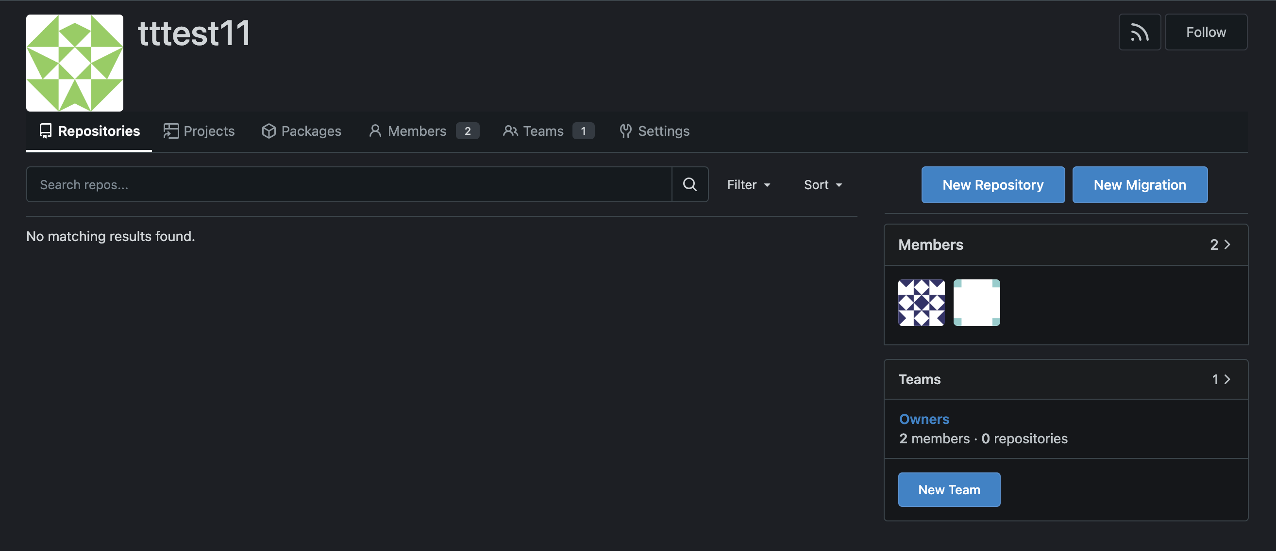
Fix: Organization Interface Display Issue ( #30133 )
...
**Before**
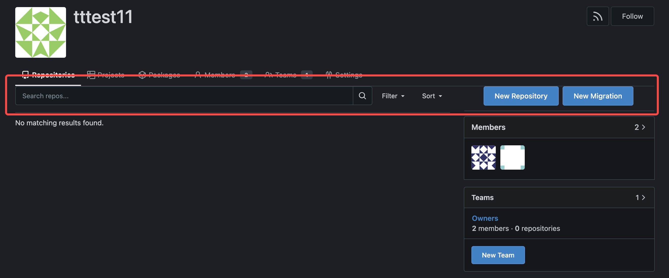
**After**
8 months ago
ec3d467f15
Migrate `gt-hidden` to `tw-hidden` ( #30046 )
...
We have to define this one in helpers.css because tailwind only
generates a single class but certain things rely on this being
double-class. Command ran:

```sh
perl -p -i -e 's#gt-hidden#tw-hidden#g' web_src/js/**/* templates/**/* models/**/* web_src/css/**/*

---------

Co-authored-by: wxiaoguang <wxiaoguang@gmail.com>
8 months ago
68ec9b4859
Migrate margin and padding helpers to tailwind ( #30043 )
...
This will conclude the refactor of 1:1 class replacements to tailwind,
except `gt-hidden`. Commands ran:

```bash
perl -p -i -e 's#gt-(p|m)([lrtbxy])?-0#tw-$1$2-0#g'   {web_src/js,templates,routers,services}/**/*
perl -p -i -e 's#gt-(p|m)([lrtbxy])?-1#tw-$1$2-0.5#g' {web_src/js,templates,routers,services}/**/*
perl -p -i -e 's#gt-(p|m)([lrtbxy])?-2#tw-$1$2-1#g'   {web_src/js,templates,routers,services}/**/*
perl -p -i -e 's#gt-(p|m)([lrtbxy])?-3#tw-$1$2-2#g'   {web_src/js,templates,routers,services}/**/*
perl -p -i -e 's#gt-(p|m)([lrtbxy])?-4#tw-$1$2-4#g'   {web_src/js,templates,routers,services}/**/*
perl -p -i -e 's#gt-(p|m)([lrtbxy])?-5#tw-$1$2-8#g'   {web_src/js,templates,routers,services}/**/*
```
8 months ago
90a4f9a49e
Migrate `gap` helpers to tailwind ( #30034 )
...
Commands ran:

```sh
perl -p -i -e 's#gt-gap-0#tw-gap-0#g'   web_src/js/**/* templates/**/*
perl -p -i -e 's#gt-gap-1#tw-gap-0.5#g' web_src/js/**/* templates/**/*
perl -p -i -e 's#gt-gap-2#tw-gap-1#g'   web_src/js/**/* templates/**/*
perl -p -i -e 's#gt-gap-3#tw-gap-2#g'   web_src/js/**/* templates/**/*
perl -p -i -e 's#gt-gap-4#tw-gap-4#g'   web_src/js/**/* templates/**/*
perl -p -i -e 's#gt-gap-5#tw-gap-8#g'   web_src/js/**/* templates/**/*

perl -p -i -e 's#gt-gap-x-0#tw-gap-x-0#g'   web_src/js/**/* templates/**/*
perl -p -i -e 's#gt-gap-x-1#tw-gap-x-0.5#g' web_src/js/**/* templates/**/*
perl -p -i -e 's#gt-gap-x-2#tw-gap-x-1#g'   web_src/js/**/* templates/**/*
perl -p -i -e 's#gt-gap-x-3#tw-gap-x-2#g'   web_src/js/**/* templates/**/*
perl -p -i -e 's#gt-gap-x-4#tw-gap-x-4#g'   web_src/js/**/* templates/**/*
perl -p -i -e 's#gt-gap-x-5#tw-gap-x-8#g'   web_src/js/**/* templates/**/*

perl -p -i -e 's#gt-gap-y-0#tw-gap-y-0#g'   web_src/js/**/* templates/**/*
perl -p -i -e 's#gt-gap-y-1#tw-gap-y-0.5#g' web_src/js/**/* templates/**/*
perl -p -i -e 's#gt-gap-y-2#tw-gap-y-1#g'   web_src/js/**/* templates/**/*
perl -p -i -e 's#gt-gap-y-3#tw-gap-y-2#g'   web_src/js/**/* templates/**/*
perl -p -i -e 's#gt-gap-y-4#tw-gap-y-4#g'   web_src/js/**/* templates/**/*
perl -p -i -e 's#gt-gap-y-5#tw-gap-y-8#g'   web_src/js/**/* templates/**/*
8 months ago
75e2e5c736
Migrate font-size helpers to tailwind ( #30029 )
...
Migrate `gt-font-*` to `tw-text-*` All tailwind-original class names are
also available and render like they would with 16px root font size.

We currently have root font size at 14px, but I would like to eventually
migrate us to 16px so that the tailwind docs apply to us unchangend and
because 16px is the recommended root font size for web pages in general.
Also the number 16 is much better dividable than 14 so will result in
more integers.
8 months ago
04f9ad0568
Fix incorrect tailwind migration ( #30007 )
...
Fixes https://github.com/go-gitea/gitea/issues/30005 . Regression from
https://github.com/go-gitea/gitea/pull/29945 .
There was only once instance of `tw-content-center` before that PR, so I
just ran below command and reverted that one instance.
```sh
perl -p -i -e 's#tw-content-center#tw-items-center#g' web_src/js/**/* templates/**/* models/**/* tests/**/*
```
8 months ago
f88ad5424f
Replace 10 more gt- classes with tw- ( #29945 )
...
Likely the biggest change of the tailwind refactors. Only thing of note
is that `tw-flex-1` resolves to `flex: 1 1 0%` while our `gt-f1` was
`flex: 1 1 0`, I don't think it will make any difference. Commands I've
ran:

```sh
perl -p -i -e 's#gt-vm#tw-align-middle#g' web_src/js/**/* templates/**/* models/**/*
perl -p -i -e 's#gt-fw#tw-flex-wrap#g' web_src/js/**/* templates/**/* models/**/*
perl -p -i -e 's#gt-f1#tw-flex-1#g' web_src/js/**/* templates/**/* models/**/*
perl -p -i -e 's#gt-fc#tw-flex-col#g' web_src/js/**/* templates/**/* models/**/*
perl -p -i -e 's#gt-sb#tw-justify-between#g' web_src/js/**/* templates/**/* models/**/*
perl -p -i -e 's#gt-je#tw-justify-end#g' web_src/js/**/* templates/**/* models/**/*
perl -p -i -e 's#gt-jc#tw-justify-center#g' web_src/js/**/* templates/**/* models/**/*
perl -p -i -e 's#gt-ac#tw-content-center#g' web_src/js/**/* templates/**/* models/**/* tests/**/*
perl -p -i -e 's#gt-df#tw-flex#g' web_src/js/**/* templates/**/* models/**/* tests/**/*
perl -p -i -e 's#gt-dib#tw-inline-block#g' web_src/js/**/* templates/**/* models/**/* tests/**/*

Co-authored-by: wxiaoguang <wxiaoguang@gmail.com>
8 months ago
34290a00c4
Migrate border and margin classes to Tailwind ( #29828 )
...
Used all existing css vars, other migrations are 1:1.

---------

Co-authored-by: wxiaoguang <wxiaoguang@gmail.com>
8 months ago
256a1eeb9a
Add `<overflow-menu>`, rename webcomponents ( #29400 )
...
1. Add `<overflow-menu>` web component
2. Rename `<gitea-origin-url>` to `<origin-url>` and make filenames
match.
<img width="439" alt="image"
src="https://github.com/go-gitea/gitea/assets/115237/2fbe4ca4-110b-4ad2-8e17-c1e116ccbd74 ">
<img width="444" alt="Screenshot 2024-03-02 at 21 36 52"
src="https://github.com/go-gitea/gitea/assets/115237/aa8f786e-dc8c-4030-b12d-7cfb74bdfd6e ">
<img width="537" alt="Screenshot 2024-03-03 at 03 05 06"
src="https://github.com/go-gitea/gitea/assets/115237/fddd50aa-adf1-4b4b-bd7f-caf30c7b2245 ">


TODO:
- [x] Check if removal of `requestAnimationFrame` is possible to avoid
flash of content. Likely needs a `MutationObserver`.
- [x] Hide tippy when button is removed from DOM.
- [x] ~~Implement right-aligned items
(https://github.com/go-gitea/gitea/pull/28976 )~~. Not going to do it.
- [x] Clean up CSS so base element has no background and add background
via tailwind instead.
- [x] Use it for org and user page.
---------
Co-authored-by: Giteabot <teabot@gitea.io>
Co-authored-by: wxiaoguang <wxiaoguang@gmail.com>
8 months ago
e0b002a4a8
Unify search boxes ( #29530 )
...
Unify all but a few search boxes to use uniform style, uniform
translations and shared templates where possible.
Remove a few duplicated search templates, e. g. code search.
<details><summary>Example after screenshots:</summary>


</details>
Also includes #29700
Co-authored-by: 6543 <6543@obermui.de>
---------
Co-authored-by: 6543 <m.huber@kithara.com>
Co-authored-by: 6543 <6543@obermui.de>
Co-authored-by: silverwind <me@silverwind.io>
Co-authored-by: Giteabot <teabot@gitea.io>
8 months ago
c337ff0ec7
Add user blocking ( #29028 )
...
Fixes #17453
This PR adds the abbility to block a user from a personal account or
organization to restrict how the blocked user can interact with the
blocker. The docs explain what's the consequence of blocking a user.
Screenshots:


---------
Co-authored-by: Lauris BH <lauris@nix.lv>
9 months ago
a2e90014ec
Replace some `gt-` classes with `tw-` ( #29570 )
...
Replace 18 `gt-` prefixes with `tw-` with perl replacement. I manually
checked them all with `rg` afterwards.
9 months ago
e3524c63d6
Filter Repositories by type ( #29231 )
...
Filter Repositories by type (resolves #1170 , #1318 )
before:

after:

9 months ago
e71eb8930a
Refactor some Str2html code ( #29397 )
...
This PR touches the most interesting part of the "template refactoring".

1. Unclear variable type. Especially for "web/feed/convert.go":
sometimes it uses text, sometimes it uses HTML.
2. Assign text content to "RenderedContent" field, for example: `
project.RenderedContent = project.Description` in web/org/projects.go
3. Assign rendered content to text field, for example: `r.Note =
rendered content` in web/repo/release.go
4. (possible) Incorrectly calling `{{Str2html
.PackageDescriptor.Metadata.ReleaseNotes}}` in
package/content/nuget.tmpl, I guess the name Str2html misleads
developers to use it to "render string to html", but it only sanitizes.
if ReleaseNotes really contains HTML, then this is not a problem.
9 months ago
f9207b0947
Refactor Safe modifier ( #29392 )
...
After this PR: no need to play with the Safe/Escape tricks anymore. See
the changes for more details.
9 months ago
532e422027
Unify organizations header ( #29248 )
...
Unify organizations header
before:

after:

---------
Co-authored-by: silverwind <me@silverwind.io>
9 months ago
c9d0e63c20
Remove unnecessary "Str2html" modifier from templates ( #29319 )
...
Follow #29165
9 months ago
a784ed3d6c
Use "Safe" modifier for manually constructed safe HTML strings in templates ( #29227 )
...
Follow #29165 . These HTML strings are safe to be rendered directly, to
avoid double-escaping.
9 months ago
aa6f88638f
Fix missing template for follow button in organization ( #29215 )
...
Leftover from https://github.com/go-gitea/gitea/pull/29005
# Before

# After

---------
Signed-off-by: Yarden Shoham <git@yardenshoham.com>
9 months ago
68227996a7
Fix broken following organization ( #29005 )
...
- following organization is broken from #28908
- add login check for the follow button in organization profile page
9 months ago
ad0b637d46
Fix button size in "attached header right" ( #28770 )
...
Before:
<details>


</details>
After:


11 months ago
dac7728e9d
Issue fixes for RSS feed improvements ( #28380 )
...
Follow-up for #28368

- Just replace button with an a-element with the button class
- Remove useless link-action class from template/org/home.tmpl
12 months ago
22cb5b0c17
Improve RSS feed icons ( #28368 )
...
- The RSS Feed icons were placed in a proper button, so that it does
  not look "inconsistent". This also makes the problem of the button
  being improperly aligned go away.
- The icon that shows on user profiles has not been modified because
  of a lack of better implementation ideas.
- Where applicable, the RSS Feed icon was put directly next to the
  Follow button (right menu), as both functionalities effectively
  share the same purpose.
- Despite the attempt at achieving less inconsistency, a conscious
  decision to not add any text to those buttons was made, opting for
  tooltips instead. "Make it present, but not too annoying."
- A special exception was made for the Releases pages (which contains
  text, not a tooltip), where an RSS feed would be particularly
  beneficial to users.

The fact that the RSS functionality is explicitly optional was taken
into account, and these improvements were made with public-facing
instances (where the feature works best) in mind.
12 months ago
4d7c063f9e
Use full width for project boards ( #28225 )
...
Inspired by #28182
1 year ago
e88377470a
Fix project counter in organization/individual profile ( #28068 )
...
Fix #28052
Before:

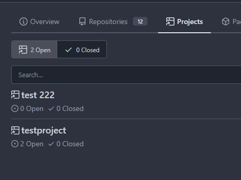
After:


1 year ago
603573366a
Add Profile Readme for Organisations ( #27955 )
...
https://blog.gitea.com/release-of-1.20.0/#-user-profile-readme-23260
(#23260 ) did introduce Profile Readme for Users.
This makes it usable for Organisations:
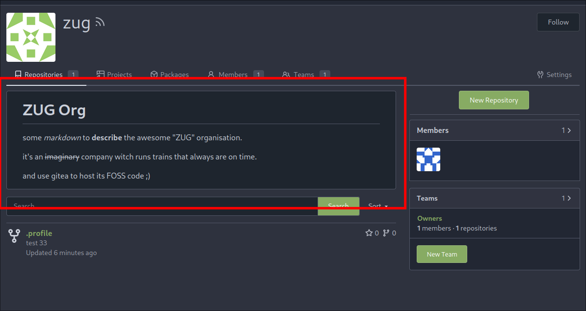
---
*Sponsored by Kithara Software GmbH*
---------
Co-authored-by: silverwind <me@silverwind.io>
Co-authored-by: KN4CK3R <admin@oldschoolhack.me>
1 year ago
4f4ddcf3c5
Add link to members and repositories at teams page ( #27744 )
...
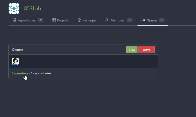
The members and repositories text now can be click.
like Org home page:
cab7b7f59c/templates/org/home.tmpl (L81-L82)
1 year ago
f39256f035
Add word-break to organization name and description ( #26624 )
...
Fix #24318
Before:


After:


1 year ago
e3afe4a248
teams: new View button ( #27685 )
...
Per the discussion on #22054 , the flow for adding a new team member to
an org is not intuitive for new Gitea users.
The ideal solution would be to add a new button on the Org > Members
index view (see the screenshot mockup in the issue description).
However, this would require a refactor of the UX for the flow. The
current flow has an implicit context of which team within the org the
new member is being added to ('Owners' by default). From the Members
index, there is no implicit context; the flow would have to add a picker
for which team the new member should be added to.
So, as a stopgap, this change simply adds a button to the Teams index
page that performs the same action as clicking on the title of the team
(a behavior that is currently too obscure as indicated in the comments
on the issue). This should reduce support burden and serve as a decent
temporary measure until the Add Member flow is refactored.
---------
Co-authored-by: tomholford <tomholford@users.noreply.github.com>
1 year ago
cbc0b7307d
Use flex-container for repo and org settings ( #27418 )
...
Same as https://github.com/go-gitea/gitea/pull/26046 but for repo and
org settings pages, reducing the margins between the boxes:
<img width="1247" alt="Screenshot 2023-10-03 at 23 25 19"
src="https://github.com/go-gitea/gitea/assets/115237/4e68ad5e-5fdc-4466-aefb-ec71bf411d45 ">
<img width="1255" alt="Screenshot 2023-10-03 at 23 27 12"
src="https://github.com/go-gitea/gitea/assets/115237/9068369b-a75d-401e-8b8d-3bd4bbe097dc ">
Co-authored-by: Giteabot <teabot@gitea.io>
1 year ago
cc5df26680
Even more `db.DefaultContext` refactor ( #27352 )
...
Part of #27065

---------

Co-authored-by: Lunny Xiao <xiaolunwen@gmail.com>
Co-authored-by: delvh <dev.lh@web.de>
1 year ago
93bd4351bf
Fix more "locale" usages ( #27259 )
1 year ago
7960ba7e2b
Always use `ctx.Locale.Tr` inside templates ( #27231 )
1 year ago
8099238618
Change green buttons to primary color ( #27099 )
...
I think it's better if the primary actions have primary color instead of
green which fits better into the overall single-color UI design. This PR
currently replaces every green button with primary:
<img width="141" alt="Screenshot 2023-09-16 at 14 07 59"
src="https://github.com/go-gitea/gitea/assets/115237/843c1e50-4fb2-4ec6-84ba-0efb9472dcbe ">
<img width="161" alt="Screenshot 2023-09-16 at 14 07 51"
src="https://github.com/go-gitea/gitea/assets/115237/9442195a-a3b2-4a42-b262-8377d6f5c0d1 ">
Modal actions now use uncolored/primary instead of previous green/red
colors. I also removed the box-shadow on all basic buttons:
<img width="259" alt="Screenshot 2023-09-16 at 14 16 39"
src="https://github.com/go-gitea/gitea/assets/115237/5beea529-127a-44b0-8d4c-afa7b034a490 ">
<img width="261" alt="Screenshot 2023-09-16 at 14 17 42"
src="https://github.com/go-gitea/gitea/assets/115237/4757f7b2-4d46-49bc-a797-38bb28437b88 ">
The change currently includes the "Merge PR" button, for which we might
want to make an exception to match the icon color there:
<img width="442" alt="Screenshot 2023-09-16 at 14 33 53"
src="https://github.com/go-gitea/gitea/assets/115237/993ac1a5-c94d-4895-b76c-0d872181a70b ">
1 year ago
ffa4949eaa
Improve flex list UI ( #26970 )
...
1. There is already `gt-ac`, so no need to introduce `flex-item-center`
2. The `flex-item-baseline` and `.flex-item-icon svg { margin-top: 1px
}` seem to be a tricky patch, they don't resolve the root problem, and
still cause misalignment in some cases.
* The root problem is: the "icon" needs to align with the sibling
"title"
* So, make the "icon" and the "title" both have the same height
3. `flex-text-inline` could only be used if the element is really
"inline", otherwise its `vertical-align` would make the box size change.
In most cases, `flex-text-block` is good enough.

---------
Co-authored-by: silverwind <me@silverwind.io>
Co-authored-by: Giteabot <teabot@gitea.io>
1 year ago
9b0743ae33
Extract common code to new template ( #26933 )
...
Same as #26903
1 year ago
65588b732c
Extract common code to new template ( #26903 )
...
I noticed that the code of several new webhook pages is highly
repetitive, so I pulled out the common parts to a new template, unified
reference, unified maintenance

---------

Co-authored-by: KN4CK3R <admin@oldschoolhack.me>
1 year ago
19a1e1b20e
Remove polluted `.ui.right` ( #26825 )
...
Each change is tested manually line by line. There are too many changes
so I can't share dozens of screenshots.

In short:

1. `ui right` could be still used in `ui top attached header`, because
there is a special case.
2. A lot of `ui right` are just no-op, so they can be removed safely.
3. Some of the `ui right` should be replaced by `gt-float-right` (to
avoid breaking, leave them to the future).
4. A few of the `ui right` could be rewritten by flex.
1 year ago
4fdb09de58
Fix incorrect "tabindex" attributes ( #26733 )
...
Fix #26731

Almost all "tabindex" in code are incorrect.

1. All "input/button" by default are focusable, so no need to use "tabindex=0"
2. All "div/span" by default are not focusable, so no need to use "tabindex=-1"
3. All "dropdown" are focusable by framework, so no need to use "tabindex"
4. Some tabindex values are incorrect (eg: `new_form.tmpl`), so remove them

Co-authored-by: Giteabot <teabot@gitea.io>
1 year ago
576644d815
Simplify helper CSS classes and avoid abuse ( #26728 )
...
Removed CSS helper classes (some of them are not useful while some of
them are abused often)
* `gt-db`: in most cases it could be replaced by `gt-df` and the flex
layout should be encouraged. Other cases: either it does need the
`gt-df` (eg: by using `div` directly) or it is an abuse (eg: the warning
message in a form)
* `gt-di`: it doesn't seem useful, or it could be replaced by `gt-dib`
in most cases.
* `gt-dif`: not useful, it could be replaced by `flex-text-inline` or
`gt-df`
* `gt-js`: never used
* All `<i class="icon gt-df gt-ac gt-jc">` could be written as `<i
class="icon">`
## Some UI samples
### Admin Notice

### Admin Stacktrace

### Org Home

### Org Team Repo

### Release List

### User Setting Application Token Scope

Co-authored-by: Giteabot <teabot@gitea.io>
1 year ago
e8b990999f
Make "link-action" backend code respond correct JSON content ( #26680 )
...
Otherwise the `link-action` JS code couldn't parse the response.

Co-authored-by: Giteabot <teabot@gitea.io>
1 year ago
7f8028e5a1
Fix display problems of members and teams unit ( #26363 )
...
Fix:
- display member count and team count in the menu bar

- Also display member unit in the menu bar if there are no hidden
members in public org

- hidden member board when there's no seeable members.
In this org, we only have hidden members:
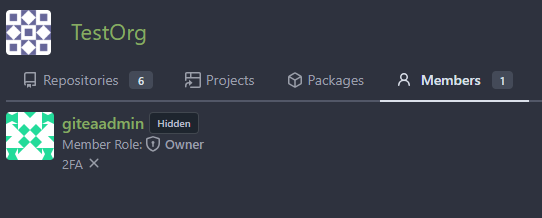
We will hidden the member board when doer is not the member of this org

Before:

If you click the number in the members board, you will access the
members page, which is not expected.

---------
Co-authored-by: delvh <dev.lh@web.de>
Co-authored-by: Giteabot <teabot@gitea.io>
1 year ago
f3fbb7c67d
Count only visible repos on profile ( #25928 )
...
Fixes #25914
1 year ago
a370efc13f
Use template context function for avatar rendering ( #26385 )
...
Introduce `AvatarUtils`, no need to pass `$.Context` to every
sub-template, and simplify the template helper functions.
1 year ago