mirror of https://github.com/go-gitea/gitea
Tag:
Branch:
Tree:
22948048b2
main
release/v1.10
release/v1.11
release/v1.12
release/v1.13
release/v1.14
release/v1.15
release/v1.16
release/v1.17
release/v1.18
release/v1.19
release/v1.20
release/v1.21
release/v1.22
release/v1.22-legacy
release/v1.8
release/v1.9
v0.9.99
v1.0.0
v1.0.1
v1.0.2
v1.1.0
v1.1.1
v1.1.2
v1.1.3
v1.1.4
v1.10.0
v1.10.0-dev
v1.10.0-rc1
v1.10.0-rc2
v1.10.1
v1.10.2
v1.10.3
v1.10.4
v1.10.5
v1.10.6
v1.11.0
v1.11.0-dev
v1.11.0-rc1
v1.11.0-rc2
v1.11.1
v1.11.2
v1.11.3
v1.11.4
v1.11.5
v1.11.6
v1.11.7
v1.11.8
v1.12.0
v1.12.0-dev
v1.12.0-rc1
v1.12.0-rc2
v1.12.1
v1.12.2
v1.12.3
v1.12.4
v1.12.5
v1.12.6
v1.13.0
v1.13.0-dev
v1.13.0-rc1
v1.13.0-rc2
v1.13.1
v1.13.2
v1.13.3
v1.13.4
v1.13.5
v1.13.6
v1.13.7
v1.14.0
v1.14.0-dev
v1.14.0-rc1
v1.14.0-rc2
v1.14.1
v1.14.2
v1.14.3
v1.14.4
v1.14.5
v1.14.6
v1.14.7
v1.15.0
v1.15.0-dev
v1.15.0-rc1
v1.15.0-rc2
v1.15.0-rc3
v1.15.1
v1.15.10
v1.15.11
v1.15.2
v1.15.3
v1.15.4
v1.15.5
v1.15.6
v1.15.7
v1.15.8
v1.15.9
v1.16.0
v1.16.0-dev
v1.16.0-rc1
v1.16.1
v1.16.2
v1.16.3
v1.16.4
v1.16.5
v1.16.6
v1.16.7
v1.16.8
v1.16.9
v1.17.0
v1.17.0-dev
v1.17.0-rc1
v1.17.0-rc2
v1.17.1
v1.17.2
v1.17.3
v1.17.4
v1.18.0
v1.18.0-dev
v1.18.0-rc0
v1.18.0-rc1
v1.18.1
v1.18.2
v1.18.3
v1.18.4
v1.18.5
v1.19.0
v1.19.0-dev
v1.19.0-rc0
v1.19.0-rc1
v1.19.1
v1.19.2
v1.19.3
v1.19.4
v1.2.0
v1.2.0-rc1
v1.2.0-rc2
v1.2.0-rc3
v1.2.1
v1.2.2
v1.2.3
v1.20.0
v1.20.0-dev
v1.20.0-rc0
v1.20.0-rc1
v1.20.0-rc2
v1.20.1
v1.20.2
v1.20.3
v1.20.4
v1.20.5
v1.20.6
v1.21.0
v1.21.0-dev
v1.21.0-rc0
v1.21.0-rc1
v1.21.0-rc2
v1.21.1
v1.21.10
v1.21.11
v1.21.2
v1.21.3
v1.21.4
v1.21.5
v1.21.6
v1.21.7
v1.21.8
v1.21.9
v1.22.0
v1.22.0-dev
v1.22.0-rc0
v1.22.0-rc1
v1.22.1
v1.22.2
v1.22.3
v1.23.0-dev
v1.3.0
v1.3.0-rc1
v1.3.0-rc2
v1.3.1
v1.3.2
v1.3.3
v1.4.0
v1.4.0-rc1
v1.4.0-rc2
v1.4.0-rc3
v1.4.1
v1.4.2
v1.4.3
v1.5.0
v1.5.0-dev
v1.5.0-rc1
v1.5.0-rc2
v1.5.1
v1.5.2
v1.5.3
v1.6.0
v1.6.0-dev
v1.6.0-rc1
v1.6.0-rc2
v1.6.1
v1.6.2
v1.6.3
v1.6.4
v1.7.0
v1.7.0-dev
v1.7.0-rc1
v1.7.0-rc2
v1.7.0-rc3
v1.7.1
v1.7.2
v1.7.3
v1.7.4
v1.7.5
v1.7.6
v1.8.0
v1.8.0-rc1
v1.8.0-rc2
v1.8.0-rc3
v1.8.1
v1.8.2
v1.8.3
v1.9.0
v1.9.0-dev
v1.9.0-rc1
v1.9.0-rc2
v1.9.1
v1.9.2
v1.9.3
v1.9.4
v1.9.5
v1.9.6
${ noResults }
7 Commits (22948048b2637495ace3091c0e0a9c6a0d96ec30)
| Author | SHA1 | Message | Date |
|---|---|---|---|
|
|
ee26d1c578
|
Button and color enhancements (#24989) (#25176)
Backport #24989. Clean cherry-pick aside from one small conflict with divider. - Various corrections to button styles, especially secondary - Remove focus highlight, it's annoying when it stays on button after press - Clearly define ghost and link buttons with demos in devtest - Remove black, grey and tertiary buttons, they should not be used - Make `arc-green` slightly darker <img width="1226" alt="image" src="https://github.com/go-gitea/gitea/assets/115237/8d89786a-01ab-40f8-ae5a-e17f40e35084"> <img width="1249" alt="image" src="https://github.com/go-gitea/gitea/assets/115237/83651e6d-3c27-46ff-b8bd-ff344d70e949"> |
1 year ago |
|
|
8a8b753647
|
Improve button-ghost, remove tertiary button (#24692)
<img width="474" alt="image" src="https://github.com/go-gitea/gitea/assets/2114189/7fd231f9-71c3-4769-ba96-37a5b77cf224"> <img width="557" alt="image" src="https://github.com/go-gitea/gitea/assets/2114189/c9945f61-39b4-4711-aea8-c34ef1d714c5"> <img width="641" alt="image" src="https://github.com/go-gitea/gitea/assets/2114189/691be76e-74fd-420d-9b9e-ba1f3b08e0b4"> And a page to test buttons: <details> <img width="451" alt="image" src="https://github.com/go-gitea/gitea/assets/2114189/5f61da24-2f36-40ad-a9bb-2205da5f5f04"> </details> --------- Co-authored-by: Giteabot <teabot@gitea.io> Co-authored-by: silverwind <me@silverwind.io> |
2 years ago |
|
|
75c62054a6
|
Improve some modal action buttons (#24289)
Follow #24097 and #24285 And add a devtest page for modal action button testing. http://localhost:3000/devtest/fomantic-modal Now the `modal_actions_confirm.tmpl` could support: green / blue / yellow positive buttons, the negative button is "secondary". ps: this PR is only a small improvement, there are still a lot of buttons not having proper colors. In the future these buttons could be improved by this approach. These buttons could also be improved according to the conclusion of #24285 in the future. 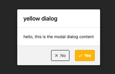 And add GitHub-like single danger button (context: https://github.com/go-gitea/gitea/issues/24285#issuecomment-1519100312)  --------- Co-authored-by: silverwind <me@silverwind.io> |
2 years ago |
|
|
7681d582cd
|
Refactor locale number (#24134)
Before, the `GiteaLocaleNumber.js` was just written as a a drop-in replacement for old `js-pretty-number`. Actually, we can use Golang's `text` package to format. This PR partially completes the TODOs in `GiteaLocaleNumber.js`: > if we have complete backend locale support (eg: Golang "x/text" package), we can drop this component. > tooltip: only 2 usages of this, we can replace it with Golang's "x/text/number" package in the future. This PR also helps #24131 Screenshots: <details> 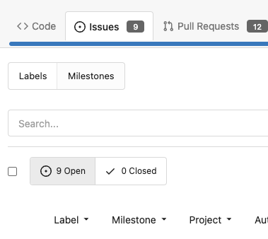  </details> |
2 years ago |
|
|
b4e952545b
|
Remove untranslatable `on_date` key (#24106)
- Follows #23988 - Fixes: #24074 by removing this key GitHub's `relative-time` elements allow us to force their rendering to `auto`, `past`, or `future` tense. We will never show an absolute date `on ...` in `TimeSince` ## Before 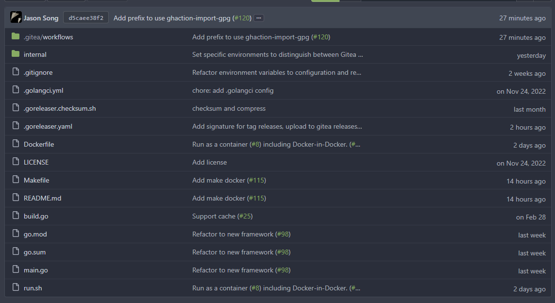 ## After 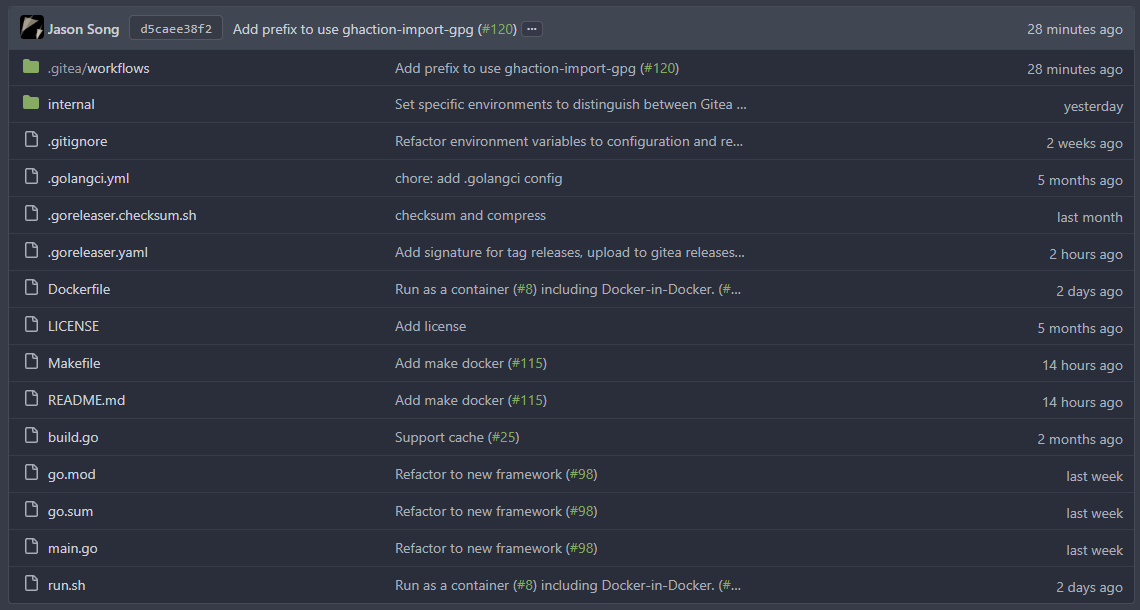 --------- Co-authored-by: wxiaoguang <wxiaoguang@gmail.com> |
2 years ago |
|
|
1c8bc4081a
|
Show friendly 500 error page to users and developers (#24110)
Close #24104 This also introduces many tests to cover many complex error handling functions. ### Before The details are never shown in production. <details> 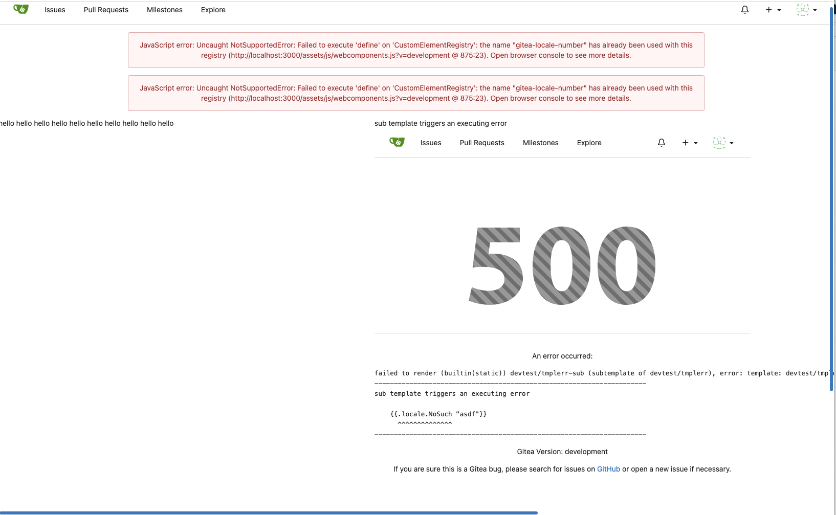 </details> ### After The details could be shown to site admin users. It is safe. 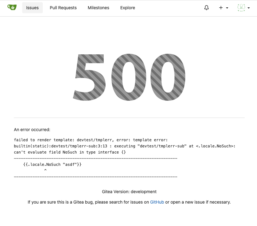 |
2 years ago |
|
|
5cc0801de9
|
Introduce GitHub markdown editor, keep EasyMDE as fallback (#23876)
The first step of the plan * #23290 Thanks to @silverwind for the first try in #15394 . Close #10729 and a lot of related issues. The EasyMDE is not removed, now it works as a fallback, users can switch between these two editors. Editor list: * Issue / PR comment * Issue / PR comment edit * Issue / PR comment quote reply * PR diff view, inline comment * PR diff view, inline comment edit * PR diff view, inline comment quote reply * Release editor * Wiki editor Some editors have attached dropzone Screenshots: <details> 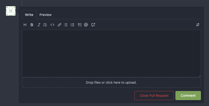 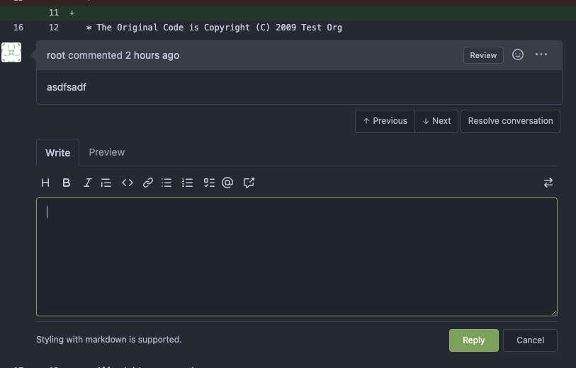  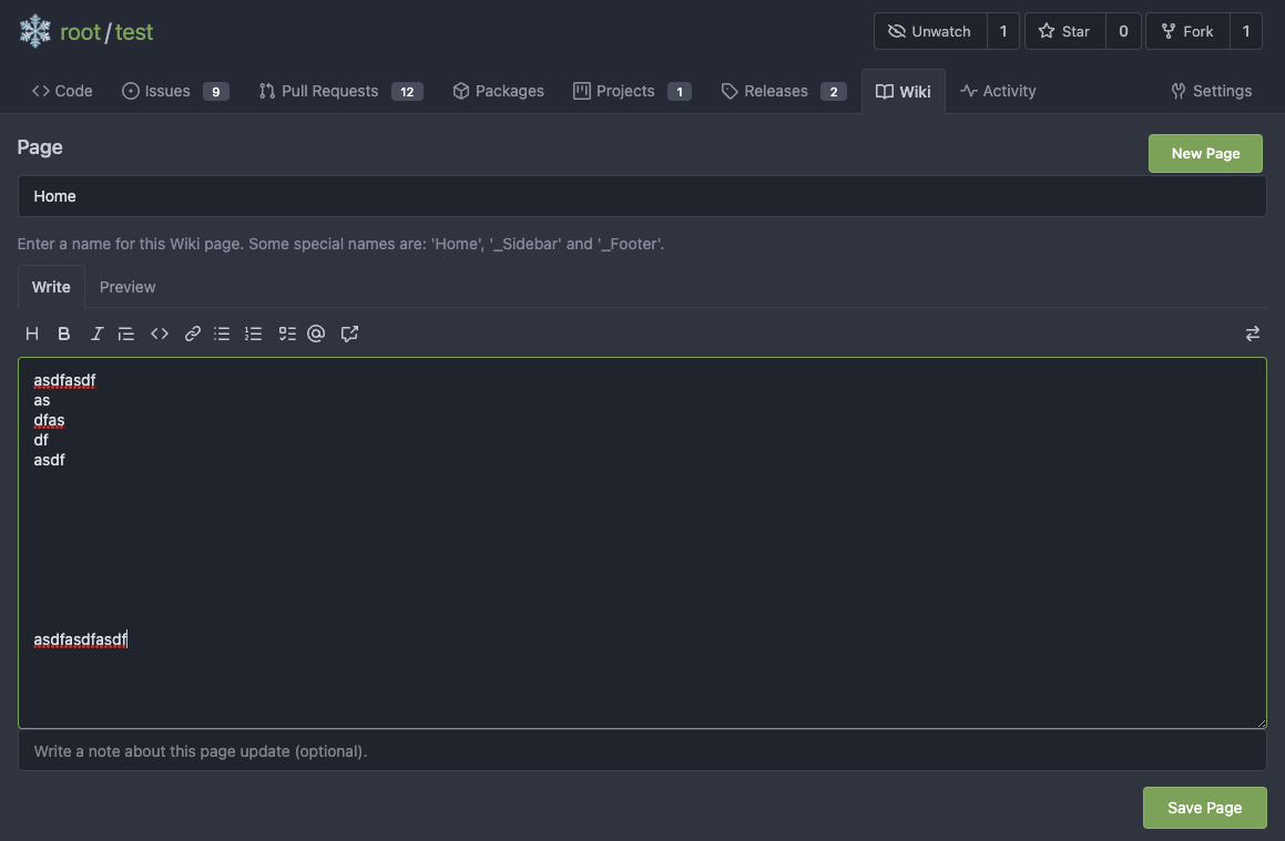 </details> --------- Co-authored-by: silverwind <me@silverwind.io> |
2 years ago |