49d7663929
Revert adding htmx until we finaly decide to add it ( #28879 )
10 months ago
1df06e3f39
Don't do a full page load when clicking the follow button ( #28872 )
...
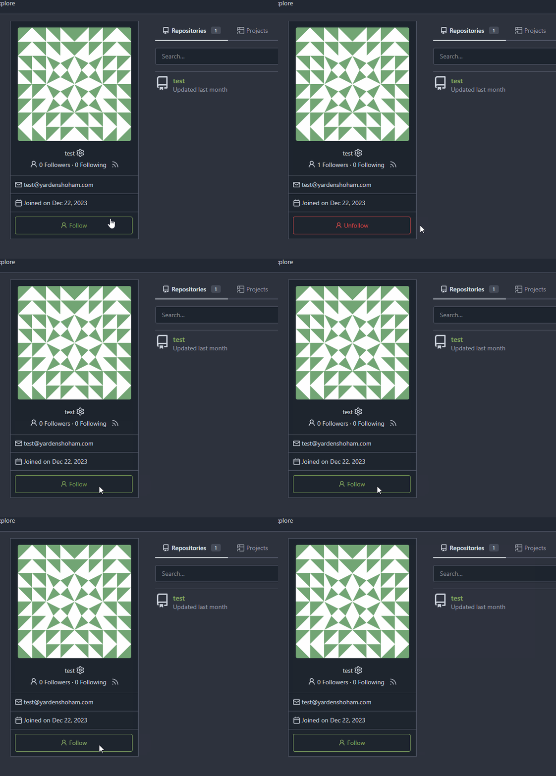
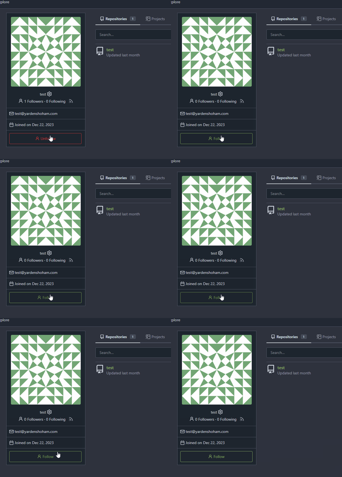
- Use htmx to perform the button request
- `hx-headers='{"x-csrf-token": "{{.CsrfToken}}"}'` to authenticate (we
should probably learn to reuse this)
- `hx-post="{{.ContextUser.HomeLink}}?action=follow"` to send a POST
request to follow the user
- `hx-target="#profile-avatar-card"` to target the card div for
replacement
- `hx-swap="outerHTML"` to replace the card (as opposed to its inner
content) with the new card that shows the new follower count and button
color
- Change the backend response to return a `<div>` tag (the card) instead
of a redirect to the user page
# Before

# After

Signed-off-by: Yarden Shoham <git@yardenshoham.com>
10 months ago
e96e440b8b
add a shortcut to user's profile page to admin user details ( #27299 )
1 year ago
112f37c546
Fix yet another `ctx` template bug ( #27417 )
...
Fixes #27416
1 year ago
93bd4351bf
Fix more "locale" usages ( #27259 )
1 year ago
7960ba7e2b
Always use `ctx.Locale.Tr` inside templates ( #27231 )
1 year ago
8099238618
Change green buttons to primary color ( #27099 )
...
I think it's better if the primary actions have primary color instead of
green which fits better into the overall single-color UI design. This PR
currently replaces every green button with primary:
<img width="141" alt="Screenshot 2023-09-16 at 14 07 59"
src="https://github.com/go-gitea/gitea/assets/115237/843c1e50-4fb2-4ec6-84ba-0efb9472dcbe ">
<img width="161" alt="Screenshot 2023-09-16 at 14 07 51"
src="https://github.com/go-gitea/gitea/assets/115237/9442195a-a3b2-4a42-b262-8377d6f5c0d1 ">
Modal actions now use uncolored/primary instead of previous green/red
colors. I also removed the box-shadow on all basic buttons:
<img width="259" alt="Screenshot 2023-09-16 at 14 16 39"
src="https://github.com/go-gitea/gitea/assets/115237/5beea529-127a-44b0-8d4c-afa7b034a490 ">
<img width="261" alt="Screenshot 2023-09-16 at 14 17 42"
src="https://github.com/go-gitea/gitea/assets/115237/4757f7b2-4d46-49bc-a797-38bb28437b88 ">
The change currently includes the "Merge PR" button, for which we might
want to make an exception to match the icon color there:
<img width="442" alt="Screenshot 2023-09-16 at 14 33 53"
src="https://github.com/go-gitea/gitea/assets/115237/993ac1a5-c94d-4895-b76c-0d872181a70b ">
1 year ago
918accaafa
Relocate the `RSS user feed` button ( #26882 )
...
before:

after:

Co-authored-by: KN4CK3R <admin@oldschoolhack.me>
1 year ago
73f6535406
Fix URL of padlock icon in profile ( #26446 )
1 year ago
a370efc13f
Use template context function for avatar rendering ( #26385 )
...
Introduce `AvatarUtils`, no need to pass `$.Context` to every
sub-template, and simplify the template helper functions.
1 year ago
d58c542579
Add 'Show on a map' button to Location in profile, fix layout ( #26214 )
...
Not too important, but I think that it'd be a pretty neat touch.

Also fixes some layout bugs introduced by a previous PR.

---------

Co-authored-by: Gusted <postmaster@gusted.xyz>
Co-authored-by: Caesar Schinas <caesar@caesarschinas.com>
Co-authored-by: wxiaoguang <wxiaoguang@gmail.com>
1 year ago
1c89f15f42
Use calendar icon for `Joined on...` in profiles ( #26215 )
1 year ago
128d77a3a0
Following up fixes for "Fix inconsistent user profile layout across tabs" ( #25739 )
...
Follow
https://github.com/go-gitea/gitea/pull/25625#issuecomment-1621577816
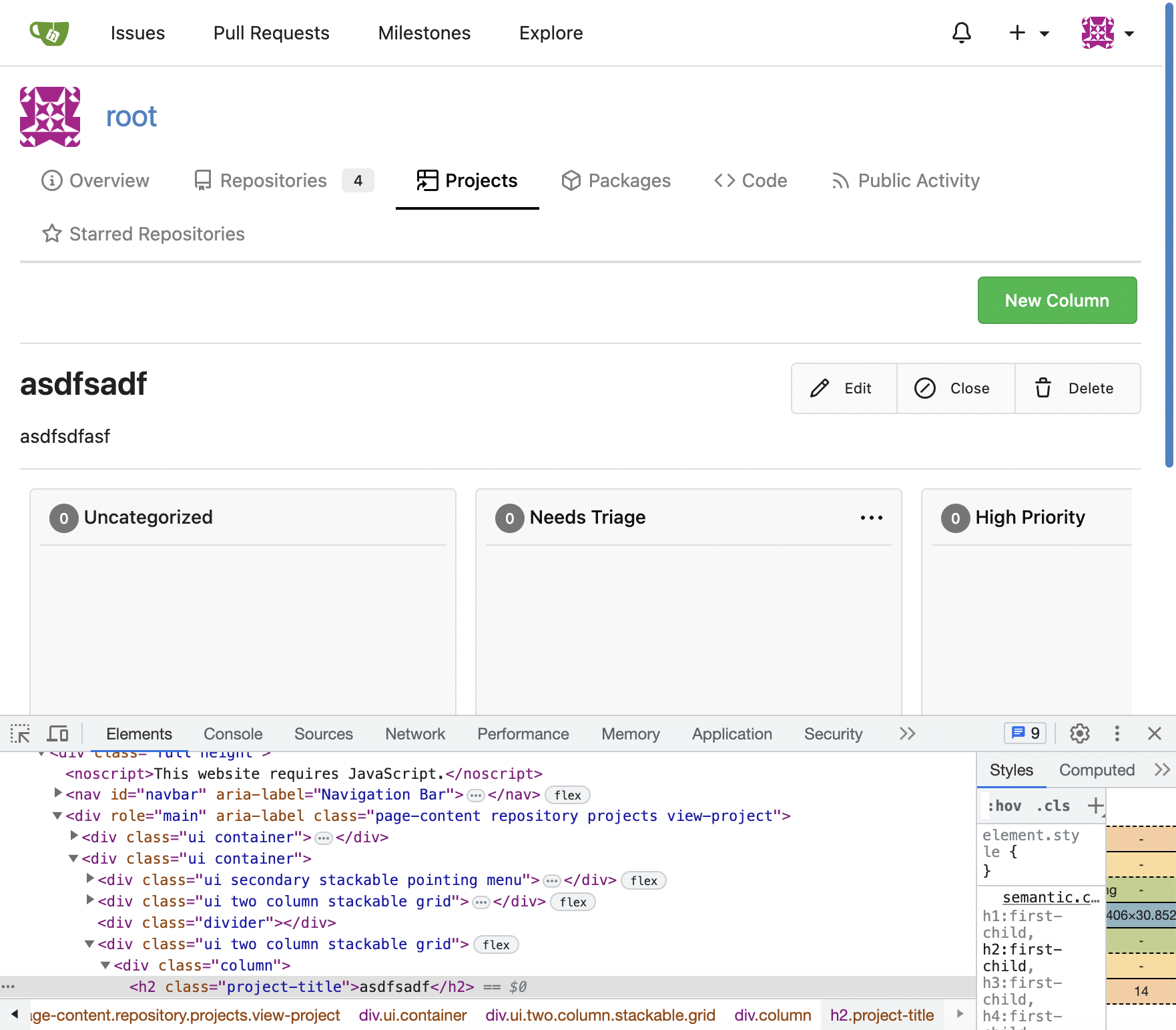
1. Fix the incorrect "project view" layout
2. Fix the "follow/unfollow" link on "packages" and "projects" tab
Before:

After:

---------
Co-authored-by: Giteabot <teabot@gitea.io>
1 year ago
2af30f715e
Fix inconsistent user profile layout across tabs ( #25625 )
...
Fix ::User Profile Page Project Tab Have Inconsistent Layout and Style
Added the big_avator for consistency in the all header_items tabs.
Fixes : #24871
> ### Description
> in the user profile page the `Packages` and `Projects` tab have small
icons for user but other tabs have bigger profile picture with user
info:
>
> ### Screenshots
> ### **For Packages And Projects:**
>

>
> ### **For Other Tabs:**
>

>
## Before

## After changes
Project View
<img width="1394" alt="image"
src="https://github.com/go-gitea/gitea/assets/80308335/95d181d7-8e61-496d-9899-7b825c91ad56 ">
Packages View
<img width="1378" alt="image"
src="https://github.com/go-gitea/gitea/assets/80308335/7f5fd60f-6b18-4fa8-8c56-7b0d45d1a610 ">
## Org view for projects page
<img width="1385" alt="image"
src="https://github.com/go-gitea/gitea/assets/80308335/6400dc89-a5ae-4f0a-831b-5b6efa020d89 ">
## Org view for packages page
<img width="1387" alt="image"
src="https://github.com/go-gitea/gitea/assets/80308335/4e1e9ffe-1e4b-4334-8657-de11b5fd31d0 ">
---------
Co-authored-by: wxiaoguang <wxiaoguang@gmail.com>
Co-authored-by: Giteabot <teabot@gitea.io>
Co-authored-by: silverwind <me@silverwind.io>
1 year ago